July 2023 - "Essex" Color Palette
My Summer Reading Challenge I gave myself is paying off. To date I’ve read six of the ten books I picked for myself to read by Labor Day and am on my seventh.
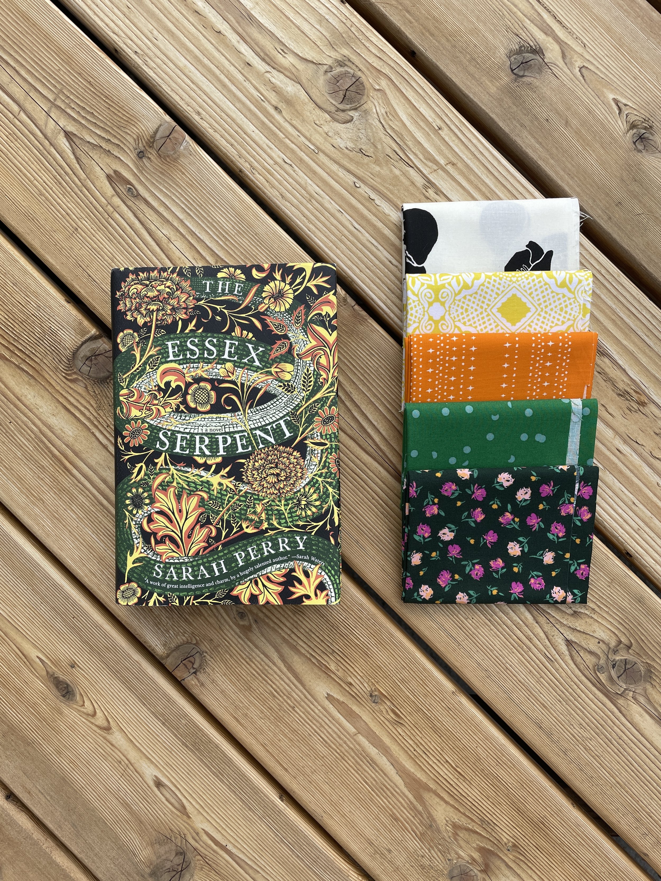
July’s color palette is live and I went with “The Essex Serpent.” The cover drew me in with the darker shades, floral patterns, and hint of a snake lurking in the beauty. I had a Facebook memory pop up and I’ve had this book on my book shelf for about five years. And after I read it, I understood why. But, let’s get into that later. Without further ado, here is the “Essex” Color Palette.

The book’s blurb would have you believe this is a mystery - a death has occurred in a small English town. The local’s believe the “Essex Serpent” committed the deed. However, it isn’t anything like that at all.
The story follows our main character Cora after the death of her husband. Her friends put her in contact with the parson, William on the premise of finding the “serpent.” It is loosely based on a 1669 pamphlet “Strange News out of Essex” that warned of a serpent. Given that, and a few early lines, I had high hopes at the start:
sometimes I think we must be walking on shoals of bodies without realizing it and all the earth’s a graveyard.
SPOILER: This is a glorified affair story (parson is married). There’s a love “triangle” and I ended up being more interested in two of the side character’s story line of trying to fix housing for the poor in London.
Martha, don’t bow your head to the way things are and always were-whole empires are brought down by nothing but ivy and time.
I didn’t feel like there was any character growth. I didn’t rate give this story many stars, 2.5 (3 is average for me) and it will go in the donation pile.
The color pull was straight forward on this one. The cream from the underbelly of the serpent along with the two tones of green from the scales - yellow and orange from the flowers. I debated with using black, but it didn’t work this go around. After the solid pull, I was super happy with the look!

The PBS Fabrics Solids used in this pull are:
091 - Snow
007 - Maize
180 - Pumpkin
074 - Forest
165 - Paradise
Honestly though, the real fun came with the patterned material pull.
Looking at them side-by-side, I was so pleased. As I continue quilting, I do find I am getting more comfortable with solids. However, when I first started, I was more a “solids are for backgrounds only” and when participating in sew-a-longs where only solids were used, I would take their solids and find close patterned options. This fabric pull took me back to those early days and memories. It’s fun to see how you’ve progressed in your quilting journey.

I will say, with the solids especially, I was nervous about putting the block together and how bold it would be. I spent some time laying out my Crazier Eights blocks (Creative Grids) and sewed it up. Here’s the result!

But wait, it gets even better!

I am so happy with the patterned version of the block - in fact, this one is likely going to get turned into its own quilt. I think I can get a baby size out of this if I play my cards right. There are many layouts you can do with this block and I’m anxious to put that together for you all.
I hope you’ve enjoyed this month’s palette. Try it out and let me know your thoughts in the comments and post your fabric pulls on Instagram with the hashtag #ohjcolorpalettes and tag me @oh_hellojenny.
Happy July!